In this part, I will illustrate the data analysis process by reproducing the analysis in Study 1 of Dietvorst, Simmons and Massey’s (2015) paper on algorithm aversion. The experiment tested the hypothesis that “seeing the model perform, and therefore err, would decrease participants’ tendency to bet on it rather than the human forecaster, despite the fact that the model was more accurate than the human.”
Experimental participants were given a judgment task, with one group allowed to see the algorithm in action before undertaking the task. Participants were given the option of using the algorithm’s predictions or their own. Those who had seen the algorithm perform were less likely to use it in the task.
22.1 The experimental design
Participants were informed that they would play the part of an MBA admissions officer with a task to forecast the success of each applicant (as a percentile). Success was defined as an equal weighting of GPA, respect, and employer prestige.
Participants were also told that “thoughtful analysts” had built a statistical model to forecast performance using data that the participants would receive.
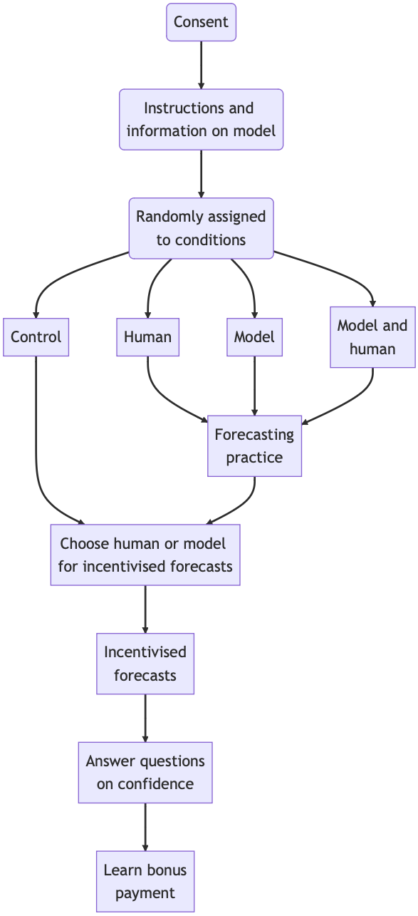
After consent and information provision, participants were allocated into one of four conditions: three treatment conditions and a control.
Participants in each of the three treatment conditions saw and/or made 15 forecasts on which they received feedback on performance.
All participants, including the control, were asked whether they would like to use their own or the model’s forecasts for all 10 incentivised forecasts. After their choice, participants would make the forecasts (even if they had chosen the model for awarding incentives). After making their forecasts, they were asked questions about their confidence in their own forecasts and that of the model. They then learned the bonus earned.
There were four experimental conditions, with the difference in conditions occurring in the first stage of the experiment. For each of the 15 MBA applicants, they would gain experience as follows.
Model: Participants would get feedback showing the model’s prediction and the applicant’s true percentile
Human: Participants would make a forecast and then get feedback showing their own prediction and the applicant’s true percentile
Model and human: Participants would make a forecast and then get feedback showing their own prediction, the model’s prediction, and the applicant’s true percentile.
Control: No experience.
Experimental flow diagram
Besides illustrating the analysis process for this subject, reproducing the analysis of a paper has other benefits.
First, it allows you to check that the original analysis is correct. This is often not the case. Most times the errors are minor, but sometimes the original finding may not even hold. In that case, there may be limited value to the replication. You may also determine that an inappropriate analysis methodology has been used.
Second, reproducing the analysis is another way to understand better the experimental methodology and what the analysis shows. You can see what variables were recorded and how they are used.
It is normally only possible to reproduce the analysis if the original data is available on a public repository or from the authors.
The download includes the Stata code used by Dietvorst et al. (2015) to analyse the data. I do not know Stata, so I asked ChatGPT to translate the code into R. While that translation contained some errors, I made it operational with only minor changes.
In what follows I provide the R code that I used to reproduce the analysis. You can expand each “Code” item to see the code or copy it to replicate the results yourself.
22.3 Analysis
I start by downloading and unzipping the data file and loading the CSV for Study 1 into the R environment. I then made some amendments to the variable names to make them more readable (e.g. replacing the numbers for each condition with the words they represent: 1=control, etc.).
Code
# Data downloaded from https://researchbox.org/379&PEER_REVIEW_passcode=MOQTEQ#Load data from csvdata <-read.csv("data/Study 1 Data.csv", header =TRUE, sep =",", na.strings =".")# Change to camel casecolnames(data) <-paste(tolower(substring(colnames(data), 1, 1)), substring(colnames(data), 2), sep ="")names(data)[1] <-"ID"# Define label mappingscondition <-c("1"="control", "2"="human", "3"="model", "4"="model&human")modelBonus <-c("0"="choseHuman", "1"="choseModel")binary <-c("0"="no", "1"="yes")betterStage2Bonus <-c("1"="model", "2"="equal", "0"="human")confidence <-c("1"="none", "2"="little", "3"="some", "4"="fairAmount", "5"="aLot")# Apply label mappings to variables - have done more here than required for analysis, but might be useful laterdata$condition <-factor(data$condition, labels = condition)data$modelBonus <-factor(data$modelBonus, labels = modelBonus)data$humanAsGoodStage1 <-factor(data$humanAsGoodStage1, labels = binary)data$humanBetterStage1 <-factor(data$humanBetterStage1, labels = binary)data$humanBetterStage2 <-factor(data$humanBetterStage2, labels = binary)data$betterStage2Bonus <-factor(data$betterStage2Bonus, labels = betterStage2Bonus)data$model <-factor(data$model, labels = binary)data$human <-factor(data$human, labels = binary)data$modelConfidence <-factor(data$modelConfidence, labels = confidence)data$humanConfidence <-factor(data$humanConfidence, labels = confidence)
I then run a quick check on the number of observations. I note from the paper that I should find 369 participants at the start, but 8 of these participants did not complete enough questions to get to the dependent variable. That leaves 361 participants across each of the conditions.
Code
# Total participantslength(data$ID)
[1] 369
Code
# Number of participants who chose between model and humantable(data$modelBonus)
choseHuman choseModel
       201        160
As expected, I find 369 participants and 201+160=361 dependent variable observations.
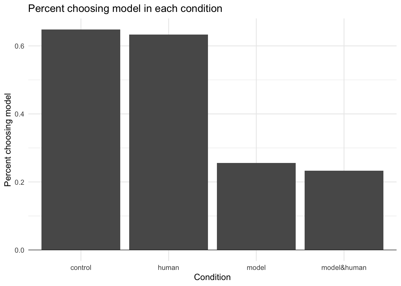
I then broke down the dependent variable findings in more detail to see what each participant chose (human or model) in each condition.
Code
# Choice of participants in each conditionconditions <-table(data$modelBonus, data$condition)conditions <-rbind(conditions, total=colSums(conditions))conditions
           control human model model&human
choseHuman      32    33    67          69
choseModel      59    57    23          21
total           91    90    90          90
Two chi-squared tests were then run to see if there was a significant difference between the conditions. The results are shown in the Study 1 diagram in Figure 3.
The first was a test of whether there was a difference between the two conditions without and the two conditions with the model. This is a test of the core hypothesis.
Code
# chisq.test between conditions 1 and 2 (control and human) and 3 and 4 (model and model&human)chisq.test(table(data$modelBonus, data$model), correct=FALSE)
The second was a test of whether there was a difference between the two conditions without and the two conditions with the human experience. This test was run to see whether the experience in seeing their own errors changed the participants’ choices.
Code
# chisq.test between conditions 1 and 3 (control and model) and 2 and 4 (human and model&human)chisq.test(table(data$modelBonus, data$human), correct=FALSE)
I then plotted that data in a bar chart to illustrate the results. This matches Figure 3 in the paper.
Code
## load ggplot2 for chart and tidyverse packages for data manipulationlibrary(ggplot2)library(dplyr)library(tidyr)# convert table to data frame for future operationsconditions <-as.data.frame.matrix(conditions)#percentage choosing model in each conditionconditions <-rbind(conditions, percent=conditions[2,]/conditions[3,])conditions <- tibble::rownames_to_column(conditions, "variable")conditions_long <-pivot_longer(conditions, cols =-variable, names_to ="treatment", values_to ="value", cols_vary ="slowest")conditions_long <- conditions_long[c(2, 1, 3)]# ggplot2 bar plot of percent rows of conditions data frameplot_data <-filter(conditions_long, variable=="percent")ggplot(plot_data, aes(x=treatment, y=value)) +geom_col()+labs(title="Percent choosing model in each condition", x="Condition", y="Percent choosing model") +theme(axis.text.x =element_text(angle =45, hjust =1)) +# Set the themetheme_minimal()+geom_hline(yintercept =0, linewidth=0.25)
Finally, I replicate the analysis related to Study 1 as shown in Table 3.
Code
# Calculate human and model mean rewardsm<-round(mean(data$bonusFromModel, na.rm=TRUE), 2)h<-round(mean(data$bonusFromHuman, na.rm=TRUE), 2)# Bonus if chose model vs. humanbonusModel <-t.test(data$bonusFromModel, data$bonusFromHuman, paired=TRUE)p <-signif(bonusModel$p.value, 2)t <-round(bonusModel$statistic, 2)d <-round(bonusModel$estimate, 2)# Participants' AAE compared to model's AAE for stage 1 forecastsstage1AAE <-t.test(data$humanAAE1, data$modelAAE1, paired=TRUE)p1 <-signif(stage1AAE$p.value, 2)t1 <-round(stage1AAE$statistic, 2)d1 <-round(stage1AAE$estimate, 2)AAEm<-round(mean(data[data$condition=='model&human', 'modelAAE1'], na.rm=TRUE), 2)AAEh<-round(mean(data[data$condition=='model&human', 'humanAAE1'], na.rm=TRUE), 2)# Participants' AAE compared to model's AAE for stage 2 forecastsstage2AAE <-t.test(data$humanAAE2, data$modelAAE2, paired=TRUE)p2 <-signif(stage2AAE$p.value, 2)t2 <-round(stage2AAE$statistic, 2)d2 <-round(stage2AAE$estimate, 2)AAEm2<-round(mean(data$modelAAE2, na.rm=TRUE), 2)AAEh2<-round(mean(data$humanAAE2, na.rm=TRUE), 2)
Table 3 results
Model
Human
Difference
t score
p value
Bonus
$1.78
$1.38
$0.4
4.98
9.7^{-7}
Stage 1 error
23.13
26.67
3.53
5.52
3.3^{-7}
Stage 2 error
22.07
26.61
4.54
11.52
2.4^{-26}
The numbers match those provided in the paper.
22.4 Regression
An alternative approach is to do the comparison between treatment and comparison groups within a regression framework. This will give us the same results but in a different format.
To determine whether there is a treatment effect, we use the regression:
Y_i=c+\beta T_i+\epsilon_i
Where Y_i is the number of participants that chose the model, c is a constant, and T_i is a treatment dummy. T_i=0 if participant i is in the control group and 1 if participant i is in the treatment group. \beta is the coefficient of the treatment dummy.
Logistic regression is used here as we are considering the probability of an event taking place (choosing the model). If we were considering a continuous variable (e.g. amount saved due to an intervention), we would use linear regression, which is typically easier to interpret.
Code
# Regression to determine whether there is a treatment effectreg <-glm(modelBonus ~ model, data=data, family=binomial)# Show resultssummary(reg)
Call:
glm(formula = modelBonus ~ model, family = binomial, data = data)

Coefficients:
            Estimate Std. Error z value Pr(>|z|)
(Intercept)   0.5792     0.1549   3.738 0.000185 ***
modelyes     -1.7077     0.2326  -7.343 2.09e-13 ***
---
Signif. codes:  0 '***' 0.001 '**' 0.01 '*' 0.05 '.' 0.1 ' ' 1

(Dispersion parameter for binomial family taken to be 1)

    Null deviance: 495.79  on 360  degrees of freedom
Residual deviance: 436.57  on 359  degrees of freedom
  (8 observations deleted due to missingness)
AIC: 440.57

Number of Fisher Scoring iterations: 4
The p-value of 2.09e-13 is not identical to that from the chi-squared test above (3.419e-14) as there are slight differences in the underlying tests, but either way, the result is significant. We can see the equivalence of the underlying result by examining the parameter estimates.
The intercept of 0.5792 implies that the odds of choosing the model are e^{0.5792} for those in the control condition, which is equal to the observed proportion of 116 choosing the model compared to 65 choosing the human (116/65=1.784). The estimate of \beta of -1.7077 implies that the ratio of the odds of those choosing the model in the control treatment condition relative to those in the control condition is e^{-1.7077}=0.181, which is equal to the observed proportion of 44 choosing the model and 136 choosing the model in the treatment condition, compared to the 116 choosing the model and 65 choosing the human in the control condition ((44/136)/(116/65)=0.181).
The benefit of using a regression approach is that other covariates can be added to the analysis. For example, if there was a difference between male and female respondents, we could add a dummy for gender to the analysis.
Including covariates in the regression can give us a more precise estimate of the impact of the intervention as they can reduce unexplained variance. However, including covariates can reduce the precision of our estimate of the treatment effect if they don’t explain enough error variance.
Often, the best covariate to include is a baseline measure of the outcome variable. With stratified randomisation, it is often recommended to add an indicator for each different stratum.
Dietvorst, B. J., Simmons, J. P., and Massey, C. (2015). Algorithm aversion: People erroneously avoid algorithms after seeing them err. Journal of Experimental Psychology: General, 144, 114–126. https://doi.org/10.1037/xge0000033